Dashboard
Command Center overview with real-time system health, smart insights, and operational widgets
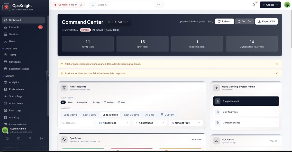
Command Center Dashboard
The Command Center is your operational headquarters — a real-time executive summary of your organization's incident health. While individual incident pages focus on specific issues, the Dashboard reveals the big picture: systemic risks, workload bottlenecks, and patterns that are invisible when looking at single tickets.
Why the Dashboard Matters
| Without Dashboard | With Dashboard |
|---|---|
| Only see individual incidents | See the "forest fire" not just trees |
| Manual health checks | Real-time system status |
| Missed patterns | AI-powered insights |
| Scattered metrics | Unified operational view |
Dashboard Layout
The Command Center is organized into distinct sections:
System Status
The System Status badge in the top-left provides an at-a-glance health indicator for your entire organization.
Status States
| Status | Visual | Condition |
|---|---|---|
| CRITICAL | 🔴 Red | Any active HIGH urgency incident exists |
| DEGRADED | 🟡 Yellow | No HIGH urgency, but active MEDIUM/LOW incidents exist |
| OPERATIONAL | 🟢 Green | No active incidents |
Status Logic
IF (active incidents with urgency = HIGH) > 0:
    status = CRITICAL
ELSE IF (active incidents) > 0:
    status = DEGRADED
ELSE:
    status = OPERATIONAL
Real-Time Updates
- Status recalculates immediately when incidents change
- Resolving the last HIGH incident downgrades from CRITICAL
- Creating a new HIGH incident upgrades to CRITICAL instantly
- No manual refresh needed
Metric Cards
The four hero cards provide immediate quantification of your current operational state.
TOTAL
| Metric | Description |
|---|---|
| Scope | All incidents within selected time range |
| Default Range | Last 30 days |
| Includes | All statuses (OPEN, ACKNOWLEDGED, RESOLVED, etc.) |
OPEN
| Metric | Description |
|---|---|
| Scope | Incidents with status OPEN only |
| Excludes | ACKNOWLEDGED, SNOOZED, SUPPRESSED |
| Purpose | Shows "To-Do" pile requiring action |
UNASSIGNED
| Metric | Description |
|---|---|
| Scope | Incidents with no assignee |
| Time Range | All time (not filtered by range selector) |
| Rationale | Ensures old unassigned tickets aren't hidden |
Note: A retention warning badge appears if your query exceeds the data retention limit.
CRITICAL
| Metric | Description |
|---|---|
| Scope | Active incidents with HIGH urgency |
| Purpose | Immediate attention counter |
| Alert Level | Most urgent issues in your organization |
Card Interactions
- Click any card to navigate to filtered incident list
- Hover shows tooltip with additional context
- Color coding indicates health (green/yellow/red)
AI Smart Insights
The dashboard runs a rules engine against your live incident data to surface actionable insights. These appear as colored banners below the metrics.
Insight Types
Workload Risk (Yellow Banner)
Trigger: Unassigned Incidents / Total Open Incidents > 30%
⚠️ Workload Risk: 25% of open incidents are unassigned
What it means: Too many issues sitting without an owner.
Action: Assign incidents to appropriate responders or teams.
Critical Spike (Red Banner)
Trigger: Active HIGH Urgency Incidents >= 3
🔴 Critical Spike: 3 active HIGH urgency incidents detected
What it means: Potential major outage or cascading failure.
Action: Assess if incidents are related; consider incident commander.
Root Cause Hint / Concentration (Blue Banner)
Trigger: Single service accounts for >= 40% of active incidents (minimum 3 incidents)
💡 Root Cause Hint: 40% of alerts are from 'API Gateway'
What it means: Dependent service may be failing, causing cascading alerts.
Action: Prioritize the concentrated service; may resolve multiple incidents.
Volume Anomaly (Blue Banner)
Trigger: Today's incident count > 1.5x the 30-day daily average
📊 Volume Anomaly: Today's incidents are 2.1x above average
What it means: Unusual noise level; "death by 1000 cuts" scenario.
Action: Investigate for deployment issues, infrastructure problems, or external factors.
Insight Priority
Insights display in priority order:
- Critical Spike (most urgent)
- Workload Risk
- Root Cause Hint
- Volume Anomaly
Maximum of 3 insights shown at once to avoid information overload.
Ops Pulse Widget
The Ops Pulse is a unified feed showing your most relevant operational information.
My Queue
Your personal incident workload:
| Item | Description |
|---|---|
| Assigned to you | Incidents where you're the assignee |
| Your teams | Incidents assigned to teams you belong to |
| On-call now | Incidents routed via schedules where you're on-call |
Critical Focus
High-priority items needing immediate attention:
| Item | Criteria |
|---|---|
| HIGH urgency | All active HIGH urgency incidents |
| SLA breaching | Incidents approaching or past SLA |
| Long-running | OPEN incidents older than 4 hours |
Services at Risk
Services currently experiencing issues:
| Status | Description |
|---|---|
| Critical | Services with HIGH urgency incidents |
| Degraded | Services with any active incidents |
| Count | Number of affected services |
Ops Pulse Interactions
- Click incident → Opens incident detail page
- Click service → Opens service detail page
- Click "View All" → Opens filtered incident list
Activity Heatmap
The heatmap visualizes incident density over the past 365 days to identify patterns.
Reading the Heatmap
     Mon Tue Wed Thu Fri Sat Sun
Week 1: ░░░ ░░░ ██░ ░░░ ░░░ ░░░ ░░░
Week 2: ░░░ ██░ ███ ██░ ░░░ ░░░ ░░░
Week 3: ░░░ ░░░ ░░░ ░░░ ███ ░░░ ░░░
...
| Intensity | Meaning |
|---|---|
| Empty | No incidents |
| Light | Below average |
| Medium | Average |
| Dark | Above average |
| Darkest | High incident day |
Pattern Recognition
Use the heatmap to identify:
| Pattern | What It Reveals |
|---|---|
| Wednesday spikes | Release day issues |
| Weekend quiet | Business hours correlation |
| Monthly clusters | Month-end processing issues |
| Holiday dips | Traffic-correlated incidents |
Heatmap Interactions
- Hover on cell → Shows date and incident count
- Click on cell → Opens incidents for that day
- Scroll → Navigate through the year
Time Range Selector
Filter dashboard data by time period.
Available Ranges
| Range | Description |
|---|---|
| Last 24 hours | Today's activity |
| Last 7 days | Weekly view |
| Last 30 days | Monthly view (default) |
| Last 90 days | Quarterly view |
| Custom | Specific date range |
What's Affected
| Component | Time-Filtered |
|---|---|
| TOTAL metric | ✅ |
| OPEN metric | ✅ |
| UNASSIGNED metric | ❌ (always all-time) |
| CRITICAL metric | ✅ |
| Smart Insights | ✅ |
| Ops Pulse | ❌ (always current) |
| Heatmap | ❌ (always 365 days) |
Retention Warning
If your selected range exceeds the data retention limit:
⚠️ Retention Limit: Data older than 90 days may be incomplete
Auto-Refresh / Kiosk Mode
Keep the dashboard current without manual refresh.
Enabling Auto-Refresh
- Click the Auto toggle in the top-right
- Select refresh interval:
- 30 seconds — High activity monitoring
- 60 seconds — Standard (default)
- 5 minutes — Low activity periods
Kiosk Mode
Perfect for NOC displays or wall monitors:
- Enable Auto-Refresh
- Press F11 for fullscreen (browser)
- Dashboard updates continuously
Auto-Refresh Behavior
| Event | Behavior |
|---|---|
| Refresh tick | All metrics and insights update |
| User interaction | Timer resets |
| Browser tab inactive | Pauses to save resources |
| Tab becomes active | Immediate refresh, timer resumes |
Quick Actions
From Dashboard
| Action | How |
|---|---|
| View all incidents | Click TOTAL card |
| View open incidents | Click OPEN card |
| View unassigned | Click UNASSIGNED card |
| View critical | Click CRITICAL card |
| Create incident | Click + Create button |
Keyboard Shortcuts
| Shortcut | Action |
|---|---|
R |
Refresh dashboard |
N |
New incident |
I |
Go to incidents |
S |
Go to services |
? |
Show keyboard help |
Filtering
Team Filter
View data for specific teams:
- Click Team dropdown
- Select one or more teams
- Dashboard filters to those teams' services
Service Filter
Focus on specific services:
- Click Service dropdown
- Select services
- Dashboard shows only selected services
Combining Filters
Filters can be combined:
- Team: "Platform Engineering" AND Service: "Payment API"
- Results show only matching data
Dashboard Permissions
| Role | Can View Dashboard |
|---|---|
| ADMIN | ✅ Full data |
| RESPONDER | ✅ Full data |
| USER | ✅ Full data |
All users can view the dashboard. Data visibility depends on team memberships when team filtering is applied.
Dashboard vs. Other Views
| Need | Use |
|---|---|
| Executive overview | Dashboard |
| Work on specific incidents | Incident List |
| Service health details | Service Directory |
| Historical metrics | Analytics |
| On-call information | Schedules |
Customization
Future Customization (Roadmap)
Planned enhancements:
- Drag-and-drop widget arrangement
- Custom metric cards
- Saved dashboard layouts
- Per-team dashboards
Current Workarounds
- Use bookmarked URLs with filters applied
- Create separate browser tabs for different views
- Use Analytics for custom reporting
Mobile Dashboard
The dashboard is responsive and mobile-friendly:
Mobile Layout
- Cards stack vertically
- Heatmap scrolls horizontally
- Ops Pulse collapses to tabs
- Touch-friendly interactions
PWA Support
- Add to home screen for app-like experience
- Works offline (shows cached data)
- Push notifications for critical changes
Troubleshooting
Dashboard Not Loading
- Check internet connection
- Clear browser cache
- Try incognito/private window
- Check for browser console errors
Metrics Seem Wrong
- Check time range selection
- Verify team/service filters
- Understand what's included (e.g., UNASSIGNED is all-time)
- Check for data retention limits
Auto-Refresh Not Working
- Verify toggle is enabled
- Check if browser tab is active
- Try disabling browser extensions
- Check for JavaScript errors
Insights Not Showing
- Insights appear only when thresholds are met
- Check if you have enough incidents
- Verify filters aren't excluding relevant data
Best Practices
Daily Operations
- Start your day with the Dashboard
- Check System Status before major changes
- Review Smart Insights for emerging patterns
- Monitor Critical Focus throughout the day
Team Standups
- Share Dashboard on standup screen
- Review Ops Pulse for current workload
- Discuss Insights for systemic issues
- Check Heatmap for recent trends
NOC/On-Call
- Use Kiosk Mode on wall displays
- Enable Auto-Refresh at 30-60 seconds
- Monitor Critical Spike alerts
- Track Unassigned to prevent backlog
Incident Commander
- Dashboard is your war room view
- System Status shows overall impact
- Services at Risk identifies affected systems
- Critical Focus prioritizes response
Related Topics
Last updated for v1
Edit this page on GitHub